The number of novel coronavirus cases is changing quickly. A real-time tracking map shows us just how quickly.
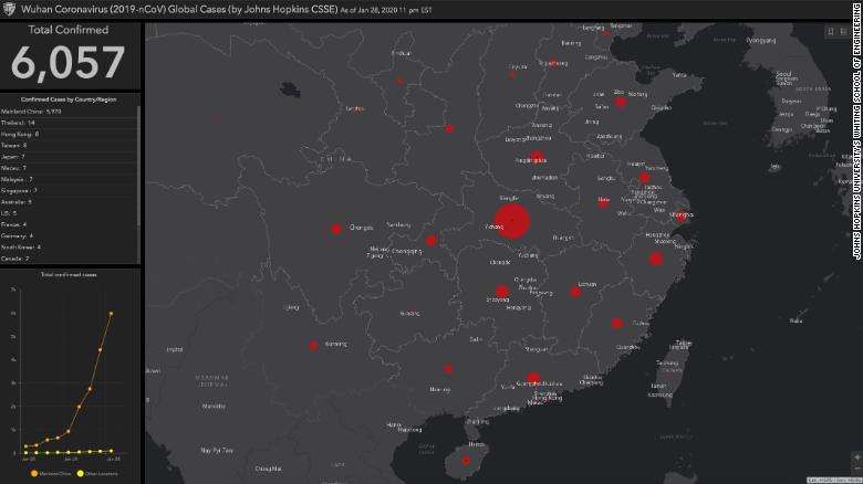
The map from Johns Hopkins University's Center for Systems Science and Engineering follows coronavirus cases across the world.
The dashboard collects data from the US Centers for Disease Control and Prevention, the World Health Organization, the European Centre for Disease Prevention and Control, the Chinese Center for Disease Control and Prevention and the Chinese website DXY, which aggregates data from China's National Health Commission and the CCDC. The results populate a worldwide view of coronavirus cases in real time.
See the map here  The coronavirus case map updates in real time as global health agencies confirm more cases.
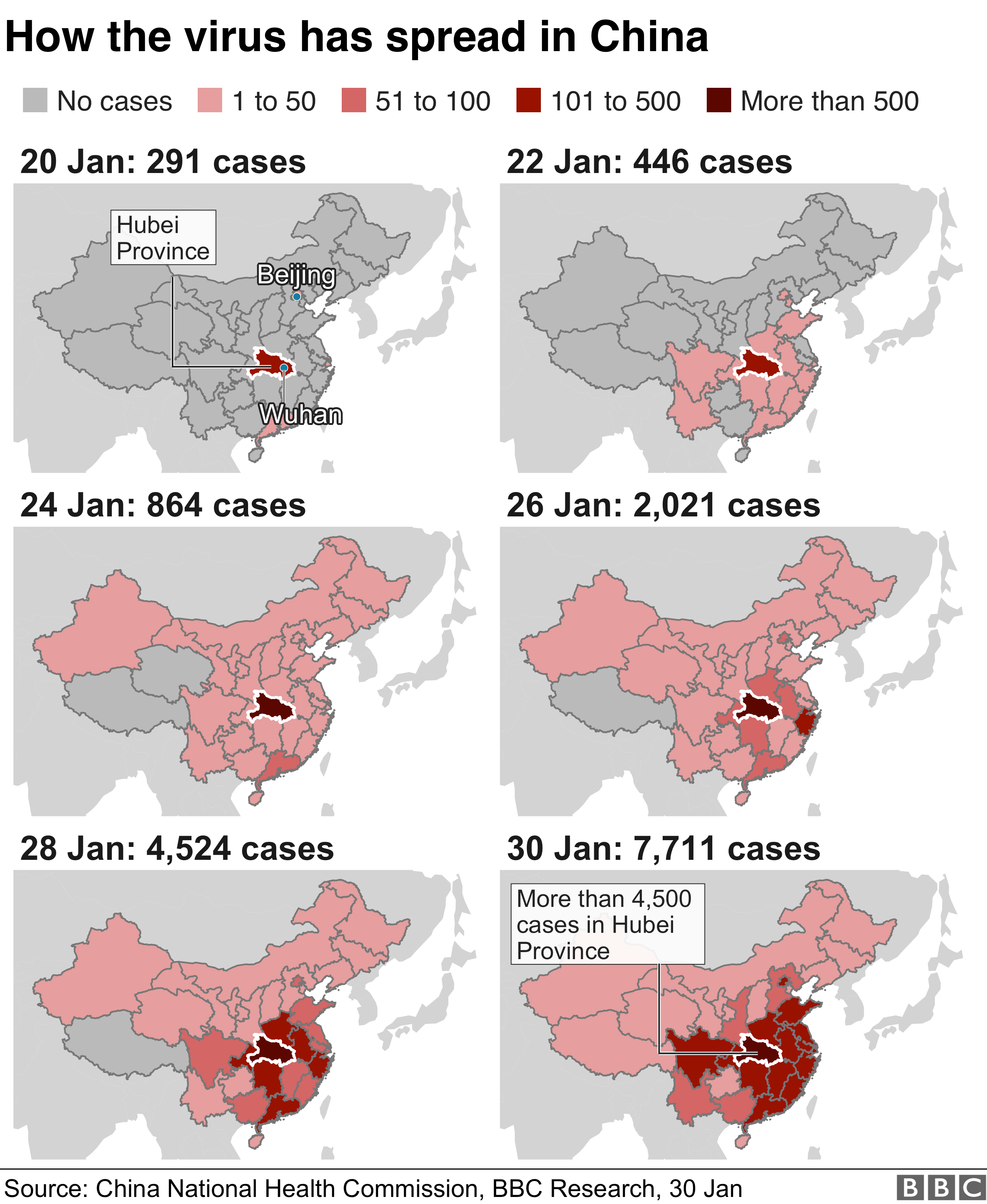
The clickable map pinpoints regions where patients have been diagnosed with coronavirus -- the more cases in a region, the larger its dot on the map (right now, the largest dot belongs to the Hubei Province, where the outbreak originated).
The map tracks deaths, too, in total and by city.
Lauren Gardner, director of the Center for Systems Science and Engineering and a civil engineering professor at Johns Hopkins, said the map isn't just a resource for the public -- health officials can download the data, which will inform research on the coronavirus in the future.
"We built this dashboard because we think it is important for the public to have an understanding of the outbreak situation as it unfolds with transparent data sources," she said. "For the research community, this data will become more valuable as we continue to collect it over time."
The dashboard also puts the outbreak into perspective: There are already more than 6,000 confirmed cases in mainland China and fewer than 100 everywhere else in the world.
The CDC regularly updates its map of confirmed coronavirus cases, too, though it shows cases by country rather than by region or city.
sumber: cnn


